This entry model is based on several different entry confirmations. To understand the model, you need basic trading knowledge.
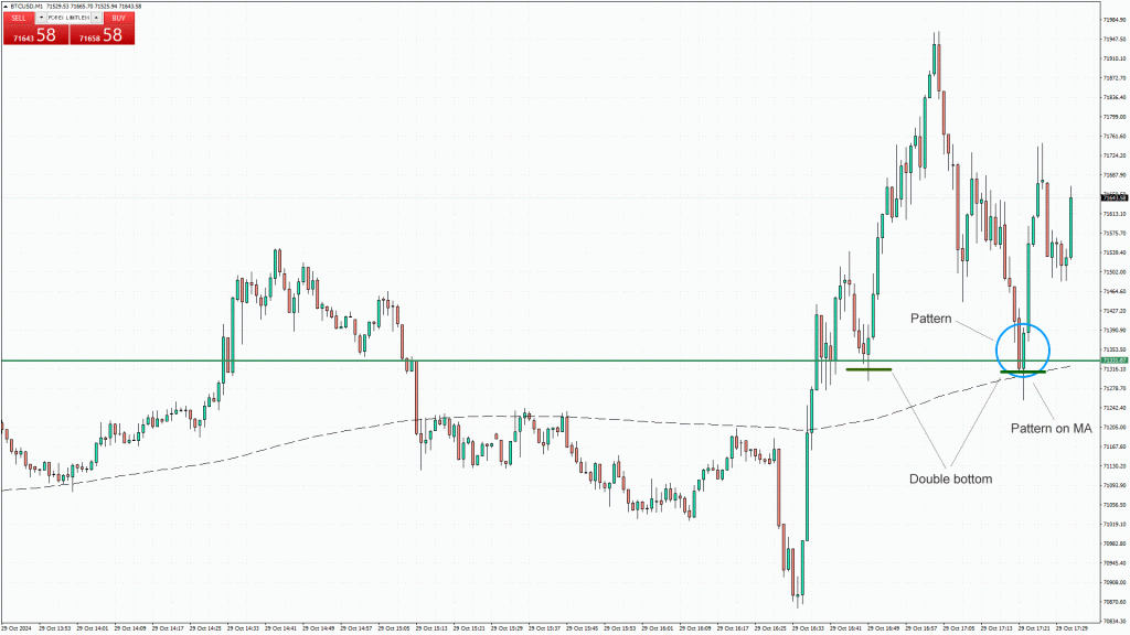
In the picture below, you can see how the market structure shifts from short to long as the price breaks above the MA (Moving Average). I usually use MAs to detect changes in trend direction on any time frame, and I only use the 200 SMA.
Once the price closes and stays above the MA, I usually look to enter the market. Confirmation occurs each time the price pulls back to the MA and forms a candlestick pattern (blue circle). In this case, I have additional confirmation from a support line (double bottom).
Time Frames – This is not a trend reversal model; it is a trend continuation model where you follow the trend from larger time frames, aiming to catch swings on smaller time frames using this approach.
Entry models, in general, are not miracle solutions, and you should not trade based solely on them. In this case, I am trading BTC/USD on the M1 time frame. I know that BTC is attempting to reach an all-time high, and the dollar index has already reached resistance, which suggests the dollar will weaken. BTC and the Dollar Index are not directly correlated, but a weak dollar can only help. The point is, I expect a buying direction and am trying to find an optimal entry like this one.

In the blue circle is my favorite candlestick pattern; you can call it whatever you like. The most important thing is that you can replace it with any pattern if you don’t prefer this one.
Important: you should never use any entry model solely because it appears; you should first determine the direction based on fundamental analysis. If you’re not strong in fundamental analysis, use a higher time frame (H4, Daily, etc.) as additional confirmation, meaning trade in the direction of the larger time frame.
This is an example of a bullish entry model; for bearish entries, everything is simply reversed.
This pattern tends to perform well in sideways markets on larger time frames, such as M30 and H1. If I spot this pattern on these higher time frames, combined with support and resistance areas or supply and demand zones, I’ll often consider taking an entry as well.
More Examples
Here, you can find more examples of Entry Model 1 to better understand it.
Example 2
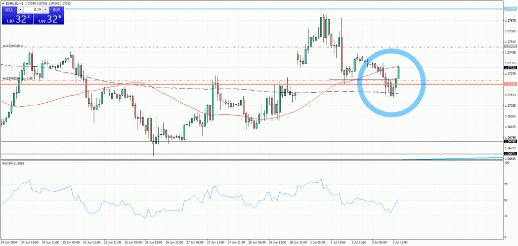
This is an old example from my journaling archive. Please ignore the RSI and the orange SMA 50.
As you can see in the image below, the price broke the SMA 200 and then retested it. A pattern formed at the SMA 200, and I felt confident about taking a trade as soon as the pattern formed. However, I was a bit worried because this red line had acted as resistance in the past. Therefore, I waited for another candle to close before entering the trade. The pair was EUR/USD on the H1 time frame.
This black horizontal line pointing to the candle after the pattern represents confirmation that the price closed successfully above the red line (previous resistance). I was essentially waiting for additional confirmation before entering the trade.

Example 3
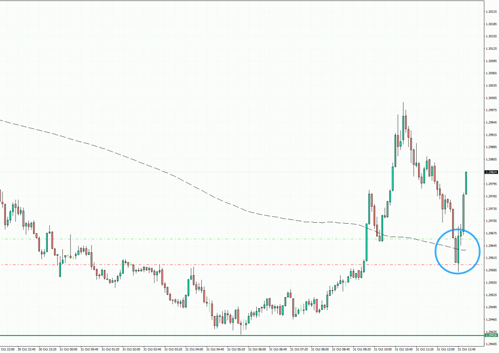
On the GBP/USD M5 timeframe, the price crossed above the 200 SMA, then retested it and formed a pattern around the SMA 200.

Example 4
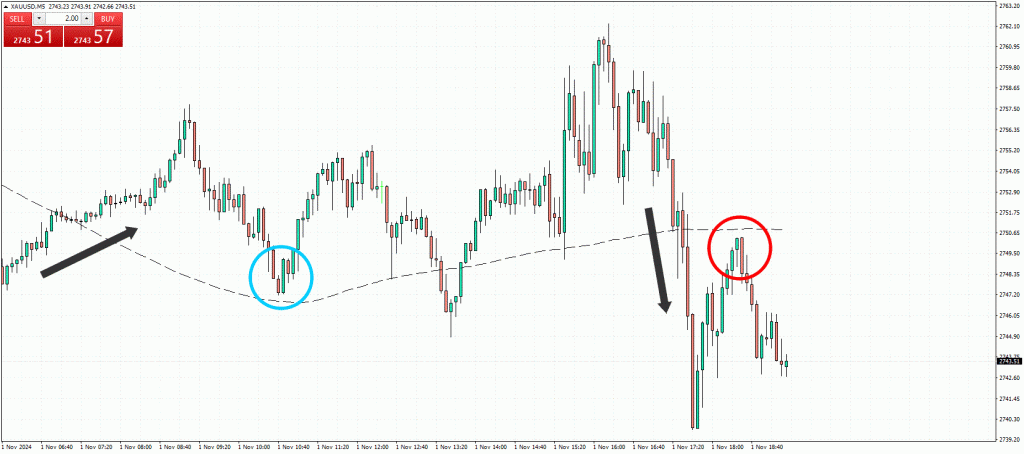
On the XAU/USD M5 time frame, this example is somewhat advanced, as the pattern does not align precisely with the MA200. The pattern is also not identical, but as long as the second candle is larger than the first, it suggests that the price is likely to move in that direction.
The first trade entry, marked by the blue circle on the left, shows the price crossing the MA, retesting it, and continuing in a bullish direction.
In the second example, marked by the red circle on the right, the price initially crosses below the MA, then retests it, forms a pattern, and continues in a bearish direction. I actually took this entry, but I missed the first one.

